10 Essential Tips for Choosing the Right Printing Paper for Your Projects?
Choosing the right printing paper is crucial for any project. The global printing paper market is expected to reach $233 billion by 2025, according to a report by Smithers Pira. This growth highlights the importance of selecting quality materials. Expert Mark Johnson states, "The type of paper used can significantly impact the final outcome of printed materials."
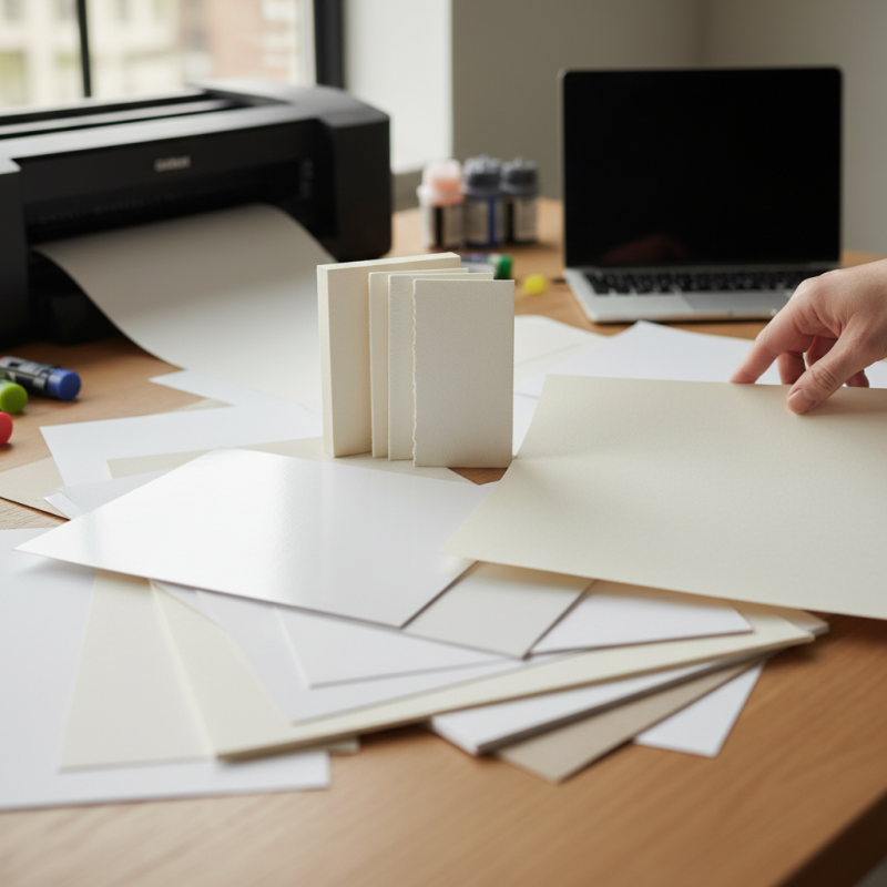
When it comes to printing paper, there are various options available. Each type serves different purposes, from glossy finishes to textured surfaces. For instance, while coated paper enhances color vibrancy, uncoated paper offers a more natural feel. Understanding these differences can help avoid common mistakes.
Many people overlook the importance of paper weight and finish. The right specifications can elevate a project, making it stand out. Yet, some still choose the cheapest option, only to regret their decision later. Failing to match the paper with the project’s needs can lead to disappointing results. Choosing wisely is essential.
Understanding Different Types of Printing Paper Available in the Market
Choosing the right printing paper is crucial for any project. With a vast array of options available, understanding the types of printing paper can make a difference. There are glossy, matte, and textured papers, each serving unique purposes.
Glossy paper is ideal for photos. It enhances colors and details. However, it may reflect light too much. Matte paper, on the other hand, is great for professional documents. It offers a smooth finish but lacks vibrancy.
Textured paper adds a tactile element to presentations and invitations. The variety can be overwhelming. Specialty papers like recycled or handmade provide sustainability options. Yet, they might not always perform equally in printers. It’s essential to try samples before making a decision.
The weight of the paper also plays a role. Heavier papers feel more substantial but may jam in some printers. Experimentation is key to finding the right balance. Recognizing the intended use of your prints will guide your choice significantly.
Evaluating Weight and Thickness for Your Printing Needs
Choosing the right printing paper begins with understanding weight and thickness. Paper weight is typically measured in grams per square meter (GSM). Heavier paper can give a more professional feel. Light paper is often used for drafts or internal documents. Think about the purpose of your project. Will it be viewed as polished and final or just a rough copy?
Thickness matters too. Thicker paper often feels sturdier and can be better for color prints. However, not all printers can handle thicker stocks. Test your printer with various weights. You might find that it struggles with some types, causing smudging or paper jams.
Consider the finish as well. Glossy papers can enhance colors, but they are prone to fingerprints. Matte paper reduces glare but might not pop as much. A balance is needed. Look at samples before purchasing. Feel the texture and assess how it aligns with your project’s tone. Making the right choice can impact how your work is perceived.
Weight and Thickness of Various Paper Types
Identifying Paper Finish: Glossy, Matte, and Textured Options
When selecting printing paper, understanding the finish is crucial.
Glossy paper offers vibrant colors and sharp images.
It reflects light, making photographs pop. However, it can sometimes create glare, making text hard to read.
If the project is text-heavy, this finish might not be ideal.
Matte paper provides a smooth, non-reflective surface.
It’s perfect for brochures or reports. The soft texture adds an elegant touch. Yet, colors may appear softer than on glossy paper.
If you crave vivid hues, matte might disappoint. Some designs lose their impact on this finish.
Textured paper offers a unique feel.
It can elevate simple projects, giving them depth and character. Think of invitations or art prints.
While appealing, textured surfaces may challenge ink absorption, potentially causing smudging. Experimenting is key.
Each project has its needs, and finding the right finish is often about trial and error.
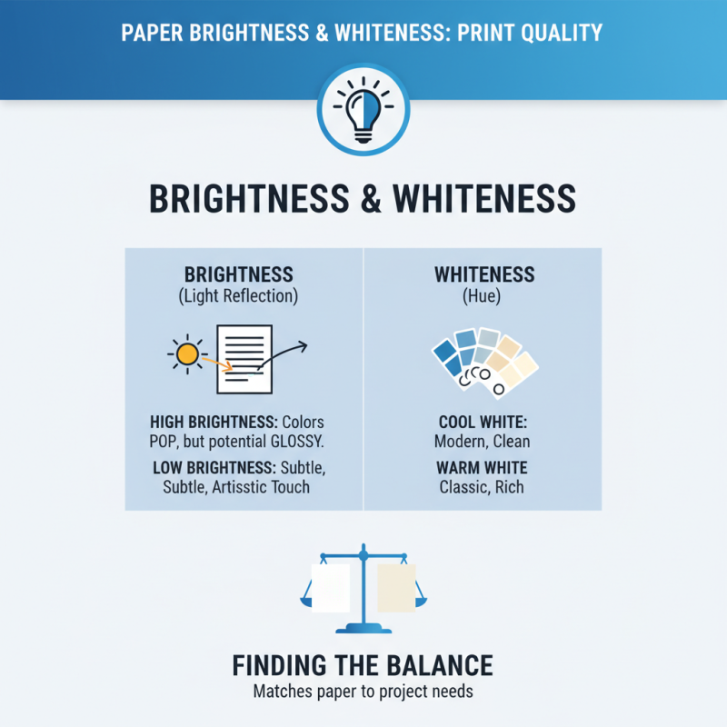
Considering Paper Brightness and Whiteness for Enhanced Print Quality
When selecting printing paper, brightness and whiteness are crucial factors. Brightness measures how much light a paper reflects. A higher brightness level can make colors pop. However, too bright can lead to glare. It’s essential to strike a balance. Paper that’s too bright may not suit all projects. For a subtle artistic touch, sometimes a lower brightness is better.
Whiteness, on the other hand, affects color accuracy. A paper with high whiteness provides a true representation of colors. Yet, not everyone prefers that stark contrast. Some may find it harsh or unappealing. Think about how the final product will look. Test prints can show you what to expect. If the paper feels off, consider lighter shades. Experimenting is part of the process, and slight imperfections can lead to surprising results.
Remember, the visual quality of your project hinges on these details. Do not overlook them. Sometimes the perfect choice is not the most obvious one. Explore different options and see what resonates best with your vision. Reflect on how brightness and whiteness impact your work. Your choices can create a unique statement.
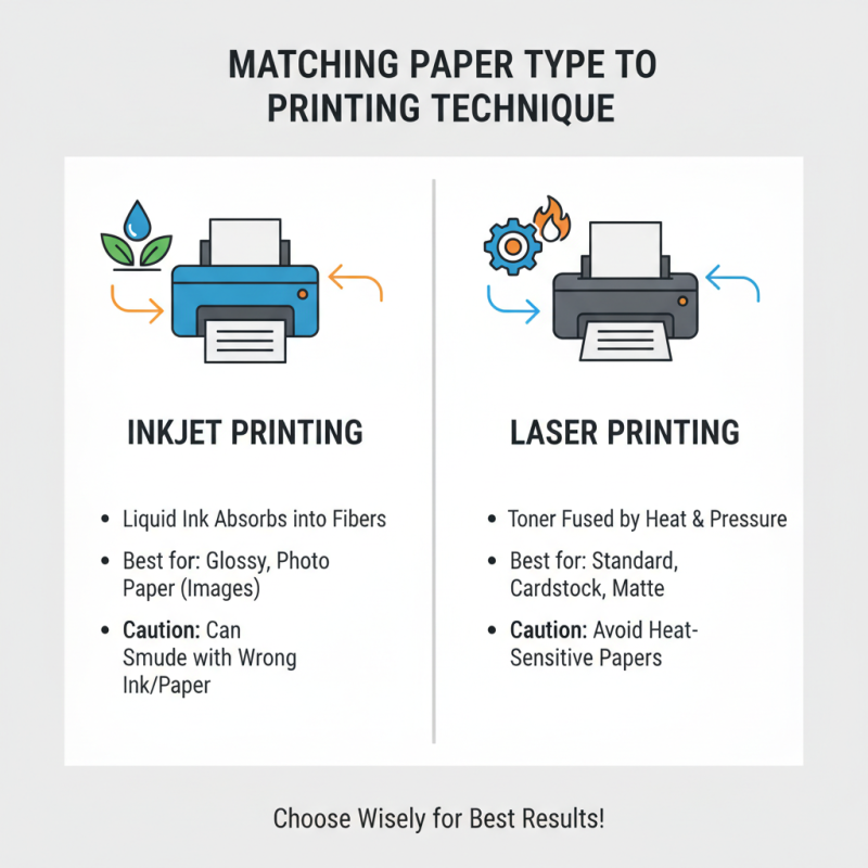
Matching Paper Type to Printing Technique: Inkjet vs. Laser Printing
Choosing the right paper often hinges on your printing technique. Inkjet and laser printing have unique requirements. Inkjet printers use liquid ink, which absorbs into paper fibers. This means the paper needs a certain texture. Glossy or photo paper works well for images. However, it can smudge with the wrong ink types. Users often overlook this detail, leading to disappointing results.
Laser printers, in contrast, rely on powdered toner. This toner bonds to the paper's surface using heat. For laser printing, smoother sheets are ideal. Textured paper can cause issues like uneven printing. Some might find that the toner doesn’t adhere properly. It's crucial to check the specifications to avoid frustration.
Consider the project scope as well. If you want a professional look, the choice of paper matters. A simple brochure may need different paper than high-quality photo prints. Reflect on your past choices. Have they always given the results you wanted? Making small adjustments can lead to major improvements in the final product.